Drinks Label Design: What Makes a Bottle Get Picked Up
Good drinks label design has about three seconds to work. That is roughly how long a shopper spends scanning a shelf before their hand moves, and in that time your label has to do the entire job of persuasion.
The short answer to what makes a bottle get picked up: legibility at distance, a clear point of difference from the bottles either side, and a physical finish that signals quality before anyone reads a word. Everything else is detail.
Positive ID Labels print for breweries, distilleries, cider makers and soft drinks producers across the UK. This guide covers the design decisions that actually change shelf performance, and the legal information that has to fit alongside them.
Drinks Label Design and the Three Second Test
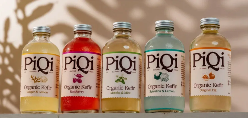
Stand back from your artwork. Six feet, not six inches. Most drinks label design is approved at arm’s length and sold at shelf distance.
At that distance, can you read the product name? Can you tell what the drink is? Does it look different from what will sit beside it? Most label artwork is designed at 100% on a screen and approved at 100% on a screen, and then fails at the only distance that matters.
Two practical rules follow. Make the product name larger than feels comfortable. And decide what one thing the label must communicate at distance, then subordinate everything else to it.
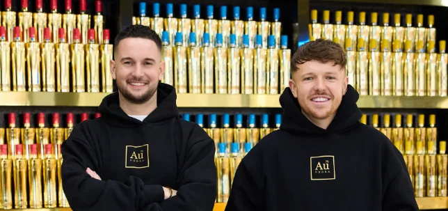
The information a customer needs before buying is usually smaller than producers assume. Tasting notes, the founder’s story and the provenance paragraph are read after the bottle is in hand, not before.
Material Choices That Change How Drinks Label Design Feels
The substrate does work that ink cannot.
For genuine metallic on higher volumes, cold foil applied inline during flexographic printing gives real foil rather than the effect of it.
Finishes and What Drinks Label Design Signals
Finish carries meaning before anyone reads the label.
Matt laminate signals restraint and premium positioning. It is the default choice for craft spirits and considered brands.
Gloss varnish lifts colour saturation and reads as bright and commercial. Right for mainstream soft drinks, wrong for a small batch gin.
Both do real protective work as well. Bottles get handled, stacked, chilled and shipped, and a laminate is often the difference between a label arriving pristine and arriving scuffed.
Legal Information Drinks Label Design Must Accommodate
Design has to leave room for the things that are not optional.
For alcoholic drinks above 1.2% ABV, the alcoholic strength must be declared along with other parts of alcohol labelling rules. Allergens must be indicated where present, and sulphites in wine are the one most often missed. Net quantity, the name and address of the food business, and lot or batch marking all need a home.
Nutrition and ingredients requirements for alcoholic drinks have been under review and vary by product type, so check current guidance rather than copying a competitor’s label.
The practical point for designers: decide where the mandatory information lives before the creative work is finished, not after. Retrofitting an ABV declaration and an allergen statement into a finished design is how good artwork gets ruined.
A back label carries most of this comfortably. Where space is genuinely tight, a peel and reveal label gives you a second printed surface without a second bottle.
Also consider if you need to include deposit return scheme labelling (coming into force in October 2027 in the UK) – retrofitting that will be an issue too.
Colour Consistency Across Reprints
This is the complaint we hear most from brand owners, usually about a previous supplier.
Colour drifts between print runs when the process is not controlled. It matters most on solid brand colours, where a small shift is obvious when two bottles sit side by side on a shelf.
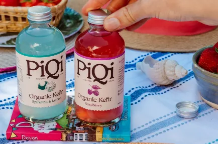
Two things reduce the risk. Specify your brand colours properly rather than leaving them to be interpreted from a supplied file. And keep repeat runs on the same press and the same material, because a design moving between processes as volumes grow is where differences appear. If colour matching is critical to your brand, say so at quote stage on 01332 864895 and we will plan the run around it.
Frequently Asked Questions
Will labels survive an ice bucket? Polypropylene labels handle immersion well. Paper labels, including textured premium papers, are moisture resistant and perform well in chilled conditions and with condensation, but they are not rated for prolonged immersion. If your drinks label design genuinely lives in ice buckets, a plastic substrate is the honest answer. For up to 24 hours, our Tintoretto stock is designed with immersion in mind and offers a premium paper finish.
Can you print on textured paper for a craft look? Yes. Our dry toner digital press prints your drinks label design at 1200dpi and handles premium textured stocks well, which is why it tends to be the route for artisan food and drink work where the physical feel of the label matters.
How do I get a metallic effect without paying for foil? Print white ink onto silver polypropylene. Where the white sits, you get an opaque printed area. Where it does not, the silver shows through. It is convincing under retail lighting and considerably cheaper than genuine cold foil. Printing colours where the white ink is missing gives a true metallic effect in any colour. Contact us if you want this look on 01332 864895.
What information does HMRC require on alcohol labels? Alcoholic strength by volume must be shown on the drinks label design for drinks above 1.2% ABV, alongside standard food information requirements including net quantity, business name and address, allergens and lot marking. Duty requirements depend on the product, so confirm current guidance for your category.
Can I use a clear label on a coloured bottle? Yes, and it can look excellent, but remember that the bottle colour becomes part of your design. Anything printed without white ink behind it will take on the bottle’s tint. White ink gives you an opaque base where you need true colour.
How much space should I leave for the back label? More than you think. Ingredients, allergens, ABV, net quantity, business address, lot code and any recycling marks add up quickly. Draft the mandatory content first, measure what it needs at a legible size, then design around it.
Talk Your Design Through With Us
Bring us your artwork at any stage. We would rather look at a rough concept and flag a problem early than receive a finished file that cannot be produced as drawn.
Tell us what the drink is, where it will be stored and how many you need, and we will advise on material, finish and what the label has to accommodate legally. Call 01332 864895 or send your artwork through the enquiry form.
We quote a fixed price over the phone, and press-ready artwork is processed at no charge.
EDITOR NOTES – DELETE BEFORE PUBLISHING
Place these internal links in natural sentences in the body copy, not in a list at the end.
- drinks labels → /printed-labels/food-beverage/drinks-labels/
- craft beer labels → /printed-labels/food-beverage/beer-labels/
- peel and reveal label → /printed-labels/specialty/peel-reveal-labels/
- cider labels → /printed-labels/food-beverage/cider-labels/