Artwork Guidelines
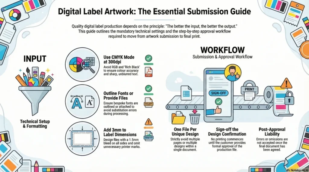
The better the input, the better the output. These artwork guidelines should help us deliver the best results for you on the first go.
This guidance should be used by all customers and where possible, have your graphic designer read this before providing new artwork.
Artwork Guidelines: Process
So this is the process we go through to make your labels:
- We receive your artwork
- This should be one file per design. You should NOT provide multiple designs on one page nor multiple pages in one file. STRICTLY One file per design.
- We must process your artwork into production files
- We seek your approval to confirm the artwork is correct by sending you a Design Confirmation
- Once approved, we will print the labels
- We wont print anything until you agree to it.
- Once you have agreed to a document, we no longer accept responsibility for any errors or omissions.
Artwork Guidelines: File Types:
- We can work with several forms of artwork including PDF, AI, SVG, EPS, JPEG, TIFF, BMP and other formats.
- We use Windows PCs as they cost a third the price of Macs.
- We use Adobe Illustrator CS6 and Photoshop CS6 or later versions.
- Our preferred format is PDF documents built in Adobe Illustrator CS4 or later. Photoshop files (even PDFs) are not suitable for production work without additional processing.
- We do experience some difficulties when working with Mac originated files; this will lead to longer preparation times.
Artwork Guidelines: File Sizes:
- Files only need enough data to print a file additional data can create very large files that add nothing to the final product.
- Composite files that include pixel/raster images need to have those images processed correctly to minimise file size.
- Images should be set to 300dpi (or 360dpi) and CMYK mode.
- Images should be scaled outside of the label file and saved as a unique file (ideally at the actual size they will be printed), then imported into the final file.
- Clipping large images in the final file is not recommended as this adds needless data to the file.
Artwork Guidelines: Barcodes:
- It is important that barcodes are not provided as flat jpeg images but are supplied as vector graphic files.
- This ensures good print reproduction and readability on your labels
- You can use online resources to create barcodes that are accuarte scalable vector graphic formats here.
Artwork Guidelines: File Settings:
- Resolution should be set to 300dpi a standard PDF will be fine
- All vector graphics formats use mathematics to plot images so we can scale these for you without the loss of image integrity
- Image processing programs like Photoshop work on pixels (rasterised) and resolution can be lost with re-sizing
- Images within vector graphics files (or images provided) should be built at 300dpi (or 360dpi if possible).
- Image modes should be set to CMYK not RGB. We print with Cyan, Magenta, Yellow and BlacK (CMYK). Graphics will often be presented in RGB (Red, Green, Blue) mode.
- If you provide files in RGB we will convert them to CMYK and colour integrity may be lost.
Artwork Guidelines: Fonts:
- Fonts in artwork pose the most frequent problem we face with customer artwork.
- They form an integral part of your brand and design so are very important for your brand.
- Many fonts in a Brands artwork are bespoke or rare.
- We carry about 1500 fonts in our font library but dont expect us to have yours unless it came with Microsoft Windows.
- If any font in your artwork is unusual or purchased, we will probably not have it.
- We will not buy fonts for you unless you pay for them in full in advance.
- You can provide a copy of your font or you can outline the text in your artwork.
- If you provide a copy of your font, we can edit text in your artwork.
- If you outline text in your artwork, we will not be able to edit it.
Artwork Guidelines: Rich Black:
Rich black uses a combination of Cyan, Magenta, Yellow and Black inks to create a deeper black. It is useful in flexographic printing but unnecessary for digital printing.
- For digital work, we do not recommend using rich black i. e. Black with Cyan, Magenta and Yellow inks. Rich blacks tend to make text blurred.
- The digital presses reproduce fantastic quality black in without the need for rich black enhancement
Artwork Guidelines: Canvases and Artboards:
- We prefer print ready (sometimes called camera ready) artwork.
- Your artwork should not need any clipping marks or other printers marks as we will only have to remove these which costs us time and money. They look nice but please omit these.
- Your file should only contain the information required to print. Please remove any superflouous elements, groupings or clipping masks.
- Additional information can be supplied in an additional file.
- Artwork should be designed to the label size +3mm on a canvas (in Photoshop) or artboard (in Illustrator)
- e. g. if your label is 50mm x 70mm, use an artboard or canvas of 53mm x 73mm
- or
- Artwork should be set to the exact label size with a 1. 5mm bleed on all sides.
- If you have a simple die line (e. g. rectangle, oval, circle etc. ) You do not need to include that.
- If you have a complex die line, please provide that on its own in a separate file or on a separate layer, with identical size and position settings as the artwork*.
- If you have multiple designs, these should be in individual files rather than multiple pages in one file or multiple designs on one page.
*If you wish to prepare the Die Line Correctly, you can set it to Spot Colour, Magenta, 0. 25pt stroke and Overprint Stroke
Digital work cannot guarantee Pantone or colour swatch match due to the technical limitations of the printing process. For digital Pantone match, you should discuss your needs with your sales representative. Digital colour matching is a chargeable service as a result of the time it takes to adjust artwork and the press settings to achieve the colour fidelity.
Related products and guides
- Read how we approached this for one customer in fast artwork case study.
- Part of our wider About Us range.
We’ve had a great experience working with this supplier, especially with Natalie - she is always very responsive, professional, and friendly. The pricing is highly competitive and the sales service has been excellent from start to finish. If I could offer one suggestion, it would be to improve the account and invoice management process. It would be really helpful if there were a system for clients to easily track their past orders and invoices in one place. Overall, very pleased with the service and look forward to continuing our collaboration.
Absolutely brilliant service from start to finish. The team are brilliant and the product was excellent quality and exactly what I wanted. Natalie is amazing as are her colleagues. Will definitely be a returning customer. Thank you
Ive used Positive ID Labelling Ltd for all our egg box labels for many years now. Natalie is always above and beyond helpful and the service is exceptionally fast and efficient.
I inadvertently ordered the incorrect label guns which was quickly sorted by Natalie. She was excellent, customer service at its best! Thank you once again